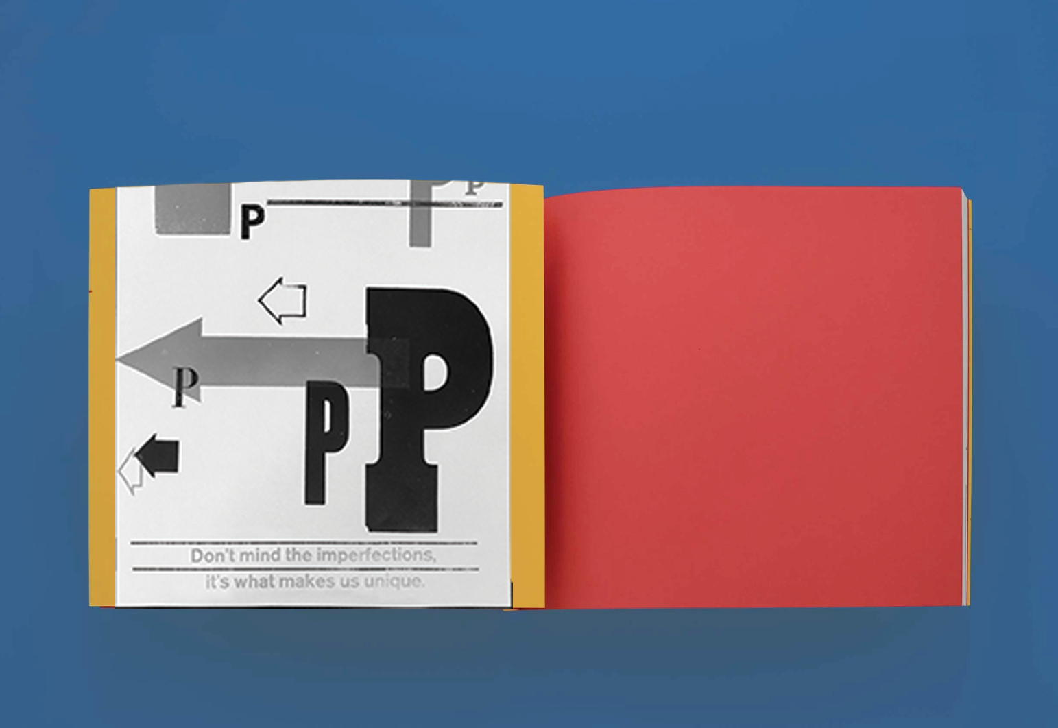
Letterpress printing for the children’s book, Drew’s ABCs.
Created at the BRED the graphic design studio, research and design education lab of Brenda McManus and Ned Drew.
The book entitled Drew’s ABCs is derived from their 20+ years of collecting a library of woodblock type and line engraved images. The alphabet comes to life using playful tongue twisters and comedic phrases. The concept for the book is to “expose the diversity within typography and celebrate its differences.”
While aiding in the printing/production process of this project, I also had the opportunity to design a custom book wrap, based on the P letterform. This traditional process of printing has helped me as a designer by gaining patience and attention to detail and feel a sense of peace while working with my hands.
There is something so special about this trade that makes everyone appreciate what we have and what we can create through it.


